Blogging on Blogger - Keeping it Fun!
For those of you who visit regularly, you can see that I've been having fun with the different page elements of this Blogger template. As much as I often "chafe at the bit" of a fixed width blog I appreciate the value they have in making the content most accessible to the majority of Internet browsers and computer platforms, not to mention computer screen sizes.
I will now however, offer an apology for those of you who wait a bit longer than usual to load my page due to the pictures I have tucked into every place I could make them work nicely. I hope the pictures are worth the extra wait. I realize that I am approaching this blog from own my visual interest aesthetic but I love well placed pictures on blogs. As you can see from my own "twist" on the traditional "blog roll", in the right side bar, I have an image blog roll. If the blog I want to link to does not have an obvious banner that I can screen capture, I try to make one that best represents the blog and will be clear in the final small image.
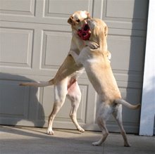
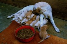
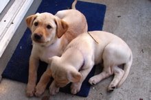
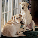
I also recently tweaked the html code to replace the little blog post title "boring little arrow image" with one of the puppies at around 4 months. I also added an image to the blog title at the top of the page. By adding in the blog description text to the picture in a different application, I was able to remove the simple text and replace it with something more "free from" and fun.
Having no idea what I'm doing when it comes to reading or editing html code, I'm sure this took me way longer than it would have for some of you "html wizards" out there. For me it was a lot of trial and error, with "oops, that's not it". So needless to say, I'm pretty thrilled with the results so far. The new widget feature in Blogger has made this easier than ever I expected, so hat's off to the designers on the Blogger Team at Google!! For being a very un-savvy computer user, I have been able to personalize more than I ever thought I would.
Go ahead. Be brave.
If I can do it so can you!!
Make it your own and have fun!!
My new Take Away:
Let the experts set it up first!


2 comments:
Oh, I'm definitely in the "oops, that's not it" category too. But it is fun to tweak! Love what you've done.
Everything looks great, all crisp and clean. I really love the top of the blog.
Wish I had the ambition/nerve/whatever it takes to do some tweaking too. But I hate to leave my comfort zone.
Post a Comment